38 Linear Dimensionality Reduction
38.1 Introduction
In research, datasets with many features are called high-dimensional datasets. The growth and update speed of datasets are accelerating, and data is developing in a high-dimensional and unstructured direction. Big complex data contains a lot of useful information, but it also increases the difficulty of identifying this information, also known as the “curse of dimensionality” (Jia et al., 2022). Additionally, a significant amount of computing time and storage space is spent on processing the data making efficient robust information retrival resource a priority. We know effective information is submerged in complex data, making it difficult to discover the essential characteristics of the data. It takes considerable time and manpower to process the data, which also negatively impacts the accuracy of recognition (Jia et al., 2022).
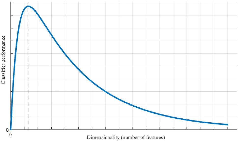
In the figure below, Jia et al., illustrate the performance of a classifier (Jia et al., 2022). As demonstrated, when the data dimension increases, the performance of the classifier improves; however, when the data dimension continues to increase, the performance of the classifier deteriorates. Analyzing the vast amount of information and extracting useful information features from high-dimensional data, as well as eliminating the influence of related or repetitive factors, are problems that can be mitigated through dimension reduction. In short, the basic principle of feature dimensionality reduction is to map a data sample from a high-dimensional space to a relatively low-dimensional space. The primary objective is to find the mapping and obtain an effective low-dimensional structure hidden in high-dimensional observable data.
38.2 Principle of Feature Dimensionality Reduction
Datasets with many characteristics are called high-dimensional data. There are often lots of redundant information in it, including related or duplicated factors. Dimensionality reduction aims to eliminate these interferences. Feature dimensionality reduction uses existing feature parameters to form a low-dimensional feature space and overcomes the effects of redundant or irrelevant information, mapping the effective information contained in the original features to fewer features (Jia et al., 2022).
In mathematical notation, suppose there is an \(n\)-dimensional vector:
\[ \mathbf{X} = [x_1, x_2, \ldots, x_n]^T, \] Note: \(T\) indicates that the vector \([x_1, x_2, \ldots, x_n]\) is being transposed from a row vector to a column vector.
These features are mapped to an \(m\)-dimensional vector \(Y\) through a map \(f\), where:
\[ \mathbf{Y} = [y_1, y_2, \ldots, y_m]^T, \]
and
\[ m \ll n. \]
The vector \(Y\) should contain the main features of vector \(X\). Mathematically, the mapping function can be expressed as:
\[ \mathbf{Y} = f(\mathbf{X}). \]
This is the process of feature extraction and selection. It can also be called the “low loss reduction dimension” process of the original data. A low-dimensional vector resulting from dimension reduction can be applied to fields such as pattern recognition, data mining, and machine learning.
This mapping \(f\) is the algorithm we want to find for feature reduction. The choice of mapping \(f\) differs depending on the dataset and question being addressed.
38.3 Linear Transformations
A specific way to achieve dimensionality reduction is through linear transformations (Worley et al., 2013). The goal of multivariate dimensionality reduction through linear transformations is to find a \(K\) x \(P\) matrix \(A\) that optimally transforms the data matrix \(X\) into a new matrix of \(P\)-dimensional scores given by \(T\):
\[ \mathbf{T} = \mathbf{X}\mathbf{A}, \]
Thus, each row of \(T\) is a transformation of the corresponding row of \(X\). Alternately, expressing the \(i\)-th row of \(X\) as a column vector \(x_i\) and the corresponding row of \(T\) as a column vector \(t_i\) shows that the so-called ‘weights’ matrix \(A^T\) defines a linear transformation from the input data space occupied by \(X\) to the output space of \(T\), termed the ‘scores’ space:
\[ \mathbf{t}_i = \mathbf{A}^T \mathbf{x}_i. \]
Another key characteristic of high-dimensional datasets is having more observed variables \(K\) than the number of observations \(N\), which is known as the ‘large \(K\), small \(N\)’ problem in statistics (Worley et al., 2013). This issue makes traditional linear regression methods unworkable because \(X\) becomes non-invertible (i.e., singular) and no unique least-squares solution can be found. Therefore, multivariate analysis methods that can handle significant collinearity in \(X\) are needed. When \(P\) is less than \(K\), the dimensionality of the scores space will be reduced compared to the input data space, achieving dimensionality reduction. This is an essential feature of multivariate analysis across various fields. By combining feature dimensionality reduction principles with linear transformations, we can effectively reduce the dimensionality of high-dimensional data while preserving its essential features, leading to more efficient and accurate analysis (Worley et al., 2013).
38.4 Principal Component Analysis (PCA)
Principal Component Analysis (PCA) is a widely used method in multivariate analysis. The main goal of PCA is to find a linear transformation that captures as much of the variance in the original data as possible in the lower-dimensional output data (Worley et al., 2013). The transformation matrix \(A\) that achieves this is composed of the first \(P\) eigenvectors of the sample covariance matrix \(S\):
\[ \mathbf{S} = \frac{1}{N-1} \mathbf{X}^T \mathbf{H} \mathbf{X} = \mathbf{Q} \mathbf{\Lambda} \mathbf{Q}^{-1} \]
Here, \(H\) is the \(N\)x\(N\) centering matrix used to center each variable around its sample mean. The second equality represents the eigendecomposition of \(S\), where \(Q\) is the matrix of eigenvectors and \(\mathbf{\Lambda}\) is a diagonal matrix of the corresponding eigenvalues. If \(X\) is left unscaled, the eigenvalues in \(\mathbf{\Lambda}\) equal the variances of the transformed data in \(T\), allowing the calculation of the ratio of variance preserved during the transformation relative to the original variance:
\[ R^2_i = \frac{\Lambda_{ii}}{\sum_{j=1}^N S_{jj}} \]
where \(R^2_i\) represents the amount of variance in \(X\) preserved in the \(i\)-th principal component. Since \(\mathbf{\Lambda_{ii}}\) decreases monotonically with \(i\), each subsequent principal component preserves progressively less of the original data’s variance.
The following exercise will demonstrate PCA utilizing the following material:
38.5 PCA Example
We will use the following steps:
-
Load the dataset:
- Import the data file.
- Check for missing values.
-
Preprocess the data:
- Handle missing values.
- Normalize the data.
-
Perform dimensionality reduction:
- Apply PCA.
- Visualize the principal components.
-
Analyze the results:
- Interpret the loadings.
- Assess the variance explained.
-
Interpret the findings:
- Relate the findings to biological significance.
- Discuss potential applications.
38.5.1 Data Source and Description
For this exercise we will use a metabolomics dataset because metabolomic datasets are inherently high-dimensional, requiring dimensionality reduction. Metabolomics is described as the quantitative measurement of the complex metabolic response of living systems to various stimuli or genetic changes. This means that metabolomic studies provide insights in the field of systems biology, capturing the molecular-level responses of an organism’s genome, transcriptome, and proteome to specific changes or stimuli. Metabolites, which are the final products of cellular processes, directly reflect enzymatic and protein activity. Therefore, they are more closely related to an organism’s phenotype or disease state than genetic or proteomic data alone. This is because a change in a gene or protein expression does not always correspond directly to a change in protein activity, whereas changes in metabolites are directly linked to such variations. As a result, metabolomics is widely used to identify disease biomarkers, support drug discovery, and study a variety of areas including plants, bacteria, nutrition, and the environment, among many other applications.
The variables in the dataset are:
- Sample
- Group
- Metabolite Concentrations (1-550)
38.5.2 Loading the Dataset
# Read the data
pca_data <- read_csv(
  "../data/06_pca_eg_metabolomics.csv",
  show_col_types = FALSE
)

# Show the first 6 rows and the first 4 columns of the data set
print(head(pca_data[, 1:4], 6))
# A tibble: 6 × 4
Sample Group Metabolite1 Metabolite2
<chr> <chr> <dbl> <dbl>
1 Blood_1 A 1432047. 292764.
2 Blood_2 A 1346463. 10518.
3 Blood_3 A 1648569. 403325.
4 Blood_4 A 3697730. 1478574.
5 Blood_5 A 1124143. 598174.
6 Blood_6 A 3694154. 421392.# Check for missing values
missing_values <- sum(is.na(pca_data))
cat("Number of missing values: ", missing_values, "\n")Number of missing values: 2 38.5.3 Preprocess the data:
# KNN imputation for missing values
# Convert data frame to matrix for KNN imputation
data_matrix <- as.matrix(pca_data[ , -c(1, ncol(pca_data))]) # Exclude Sample and Group columns
data_matrix_imputed <- kNN(data_matrix, k = 5, imp_var = FALSE)

# Convert back to data frame and add the Sample and Group columns
pca_data_imputed <- as.data.frame(data_matrix_imputed)
pca_data_imputed$Sample <- pca_data$Sample
pca_data_imputed$Group <- pca_data$Group

# Pivot longer for ggplot
pca_data_long <- pivot_longer(
  data = pca_data_imputed,
  cols = -c(Sample, Group),
  names_to = "Metabolite",
  values_to = "Concentration"
)

# Ensure Concentration column is numeric
pca_data_long$Concentration <- as.numeric(pca_data_long$Concentration)
# Set the maximum x-axis limit
max_x_limit <- 2e6 # Adjust this value as needed
# Create the histogram with a continuous scale and limited x-axis
ggplot(pca_data_long, aes(x = Concentration)) +
geom_histogram(bins = 100, fill = viridis(100)) +
scale_x_continuous(limits = c(0, max_x_limit)) +
theme_minimal() +
labs(
title = "Histogram of Metabolite Concentrations",
y = "Frequency",
x = "Concentration"
) +
theme(axis.text.x = element_text(angle = 90, hjust = 1))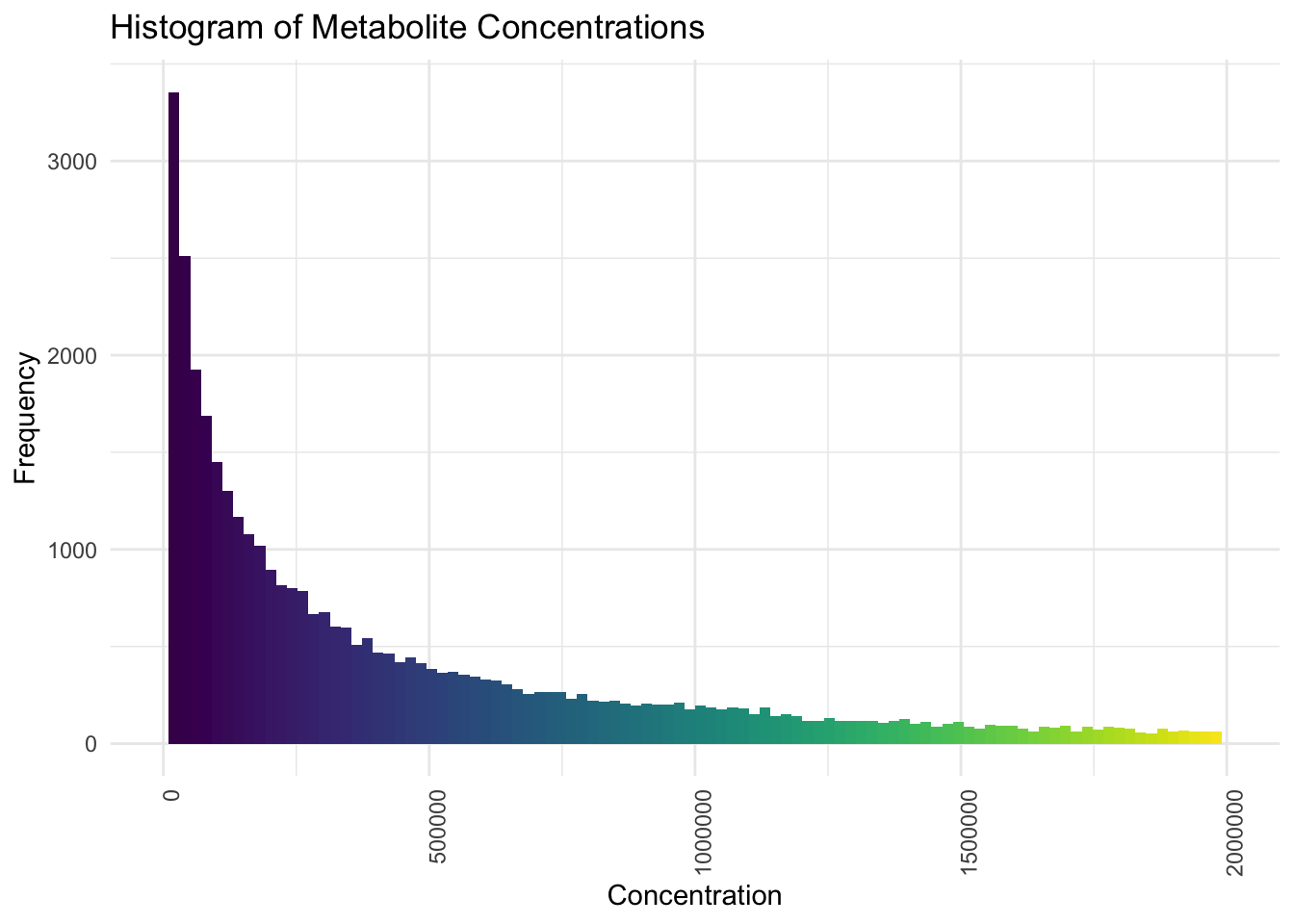
Now we will apply Log base 10 Transformation
# Plot histogram for the overall distribution of metabolite concentrations after log transformation
ggplot(pca_data_long, aes(x = Log_Concentration)) +
  geom_histogram(bins = 30, fill = viridis(30)) +
  theme_minimal() +
  labs(
    title = "Histogram of Metabolite Concentrations (After Log Transformation)",
    y = "Frequency",
    x = "Log10(Concentration)"
  ) +
  theme(axis.text.x = element_text(angle = 90, hjust = 1))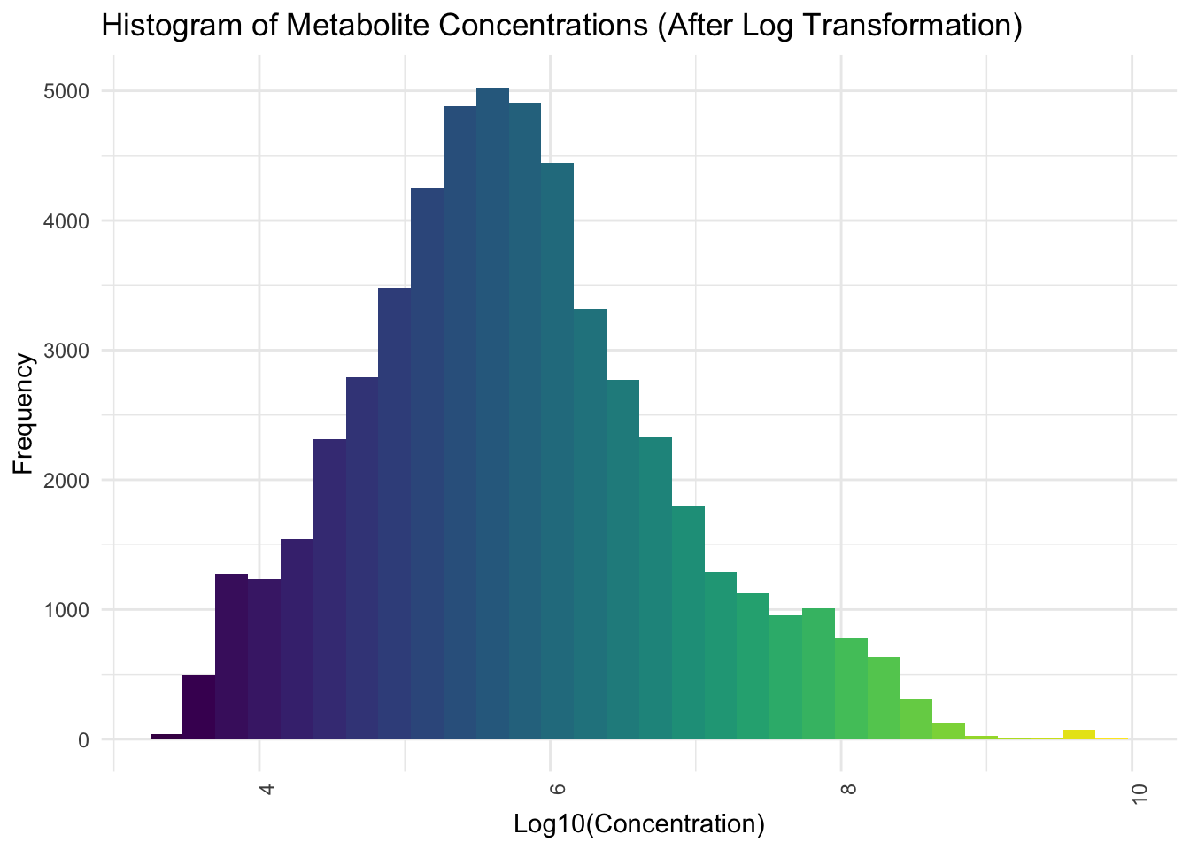
Now we will apply Autoscaling
# Autoscaling (standardization)
preProcValues <- preProcess(
  pca_data_long[, "Log_Concentration", drop = FALSE],
  method = c("center", "scale")
)
scaled_values <- predict(
  preProcValues,
  pca_data_long[, "Log_Concentration", drop = FALSE]
)

# Convert the scaled values from tibble to numeric vector
pca_data_long$Scaled_Log_Concentration <- as.numeric(scaled_values$Log_Concentration)
# Plot histogram for the overall distribution of metabolite concentrations
# after autoscaling
ggplot(pca_data_long, aes(x = Scaled_Log_Concentration)) +
geom_histogram(bins = 30, fill = viridis(30)) +
theme_minimal() +
labs(
title = "Histogram of Metabolite Concentrations (After Autoscaling)",
y = "Frequency",
x = "Scaled Log10(Concentration)"
) +
theme(axis.text.x = element_text(angle = 90, hjust = 1))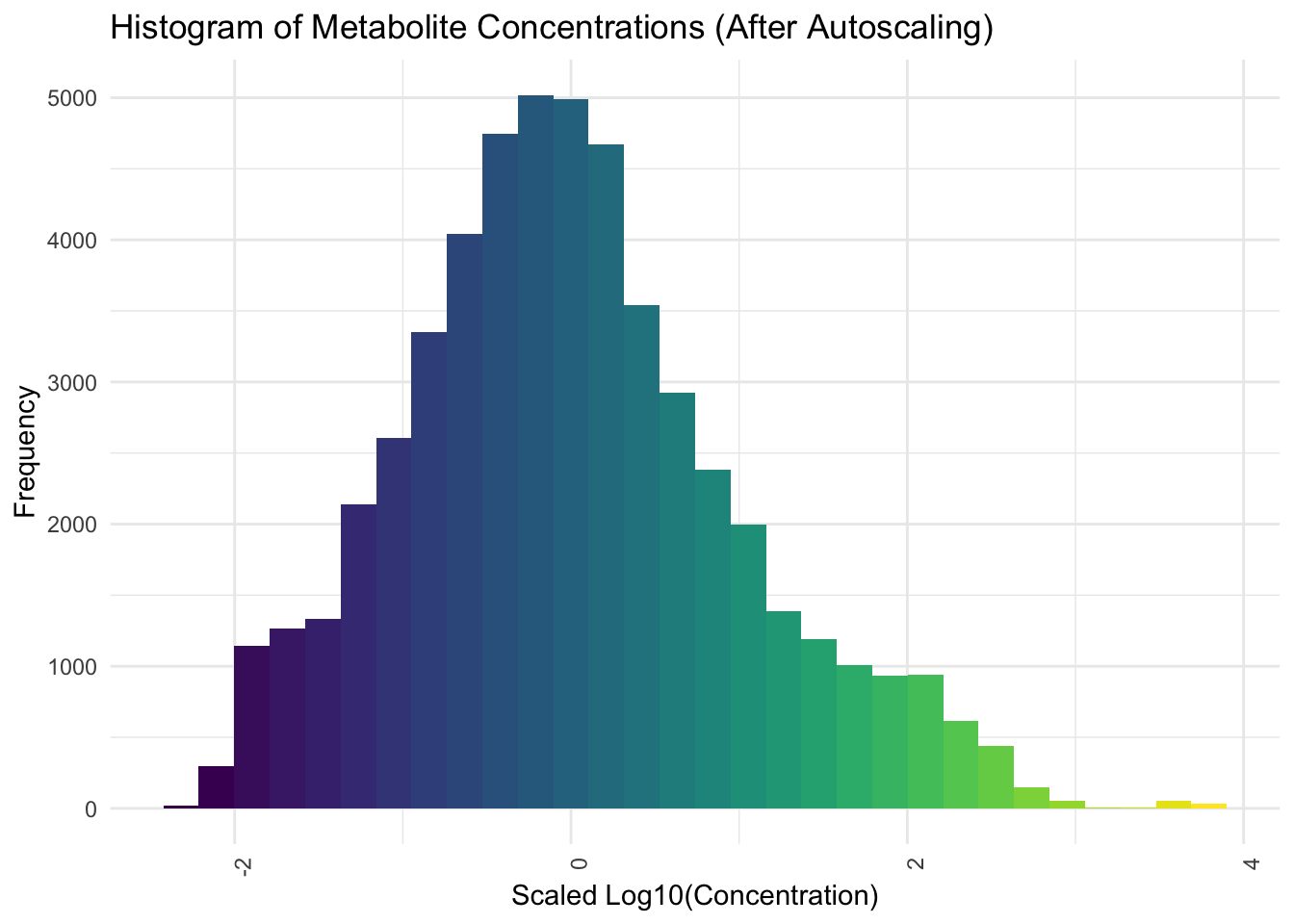
38.5.4 Perform Dimensionality Reduction
# Pivot the data to wide format for PCA
pca_data_wide <- pca_data_long %>%
  dplyr::select(Sample, Group, Metabolite, Scaled_Log_Concentration) %>%
  pivot_wider(names_from = Metabolite, values_from = Scaled_Log_Concentration)

# Perform PCA on the scaled log concentration data
pca_result <- prcomp(
  pca_data_wide[, -c(1, 2)],
  center = TRUE, scale. = TRUE,
  # To return the metabolite data rotated into the PC vector space; this is the
  #   matrix we will use to reduce the dimension
  retx = TRUE
)

# Calculate the percentage of variance explained by each principal component
percent_var <- round(100 * pca_result$sdev^2 / sum(pca_result$sdev^2), 1)
pc1_label <- paste0("PC1 (", percent_var[1], "%)")
pc2_label <- paste0("PC2 (", percent_var[2], "%)")
# Plot PCA biplot after preprocessing with ellipses (only individuals)
fviz_pca_ind(
pca_result,
# Show points only (not text)
geom.ind = "point",
# Color by group
col.ind = pca_data_wide$Group,
# Use viridis color palette
palette = viridis( length(unique(pca_data_wide$Group)) ),
# Add concentration ellipses
addEllipses = TRUE,
legend.title = "Groups",
# Increase point size
pointsize = 4
) +
labs(title = "PCA Biplot", x = pc1_label, y = pc2_label) +
theme_minimal() +
theme(legend.position = "right")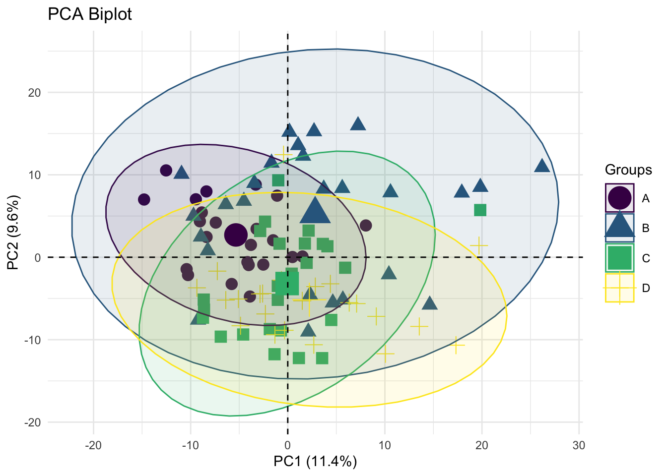
Description: This plot shows the distribution of samples across the first two principal components (PC1 and PC2), which explain 11.4% and 9.6% of the variance, respectively. Different groups (A, B, C, D) are represented by distinct shapes and colors.
# Scree Plot
fviz_eig(
  pca_result,
  addlabels = TRUE,
  ylim = c(0, 50),
  barfill = viridis(1, begin = 0.7, end = 0.7)
) +
  labs(
    title = "Scree Plot",
    x = "Principal Components",
    y = "Percentage of Variance Explained"
  ) +
  theme_minimal() +
  scale_color_viridis(discrete = TRUE)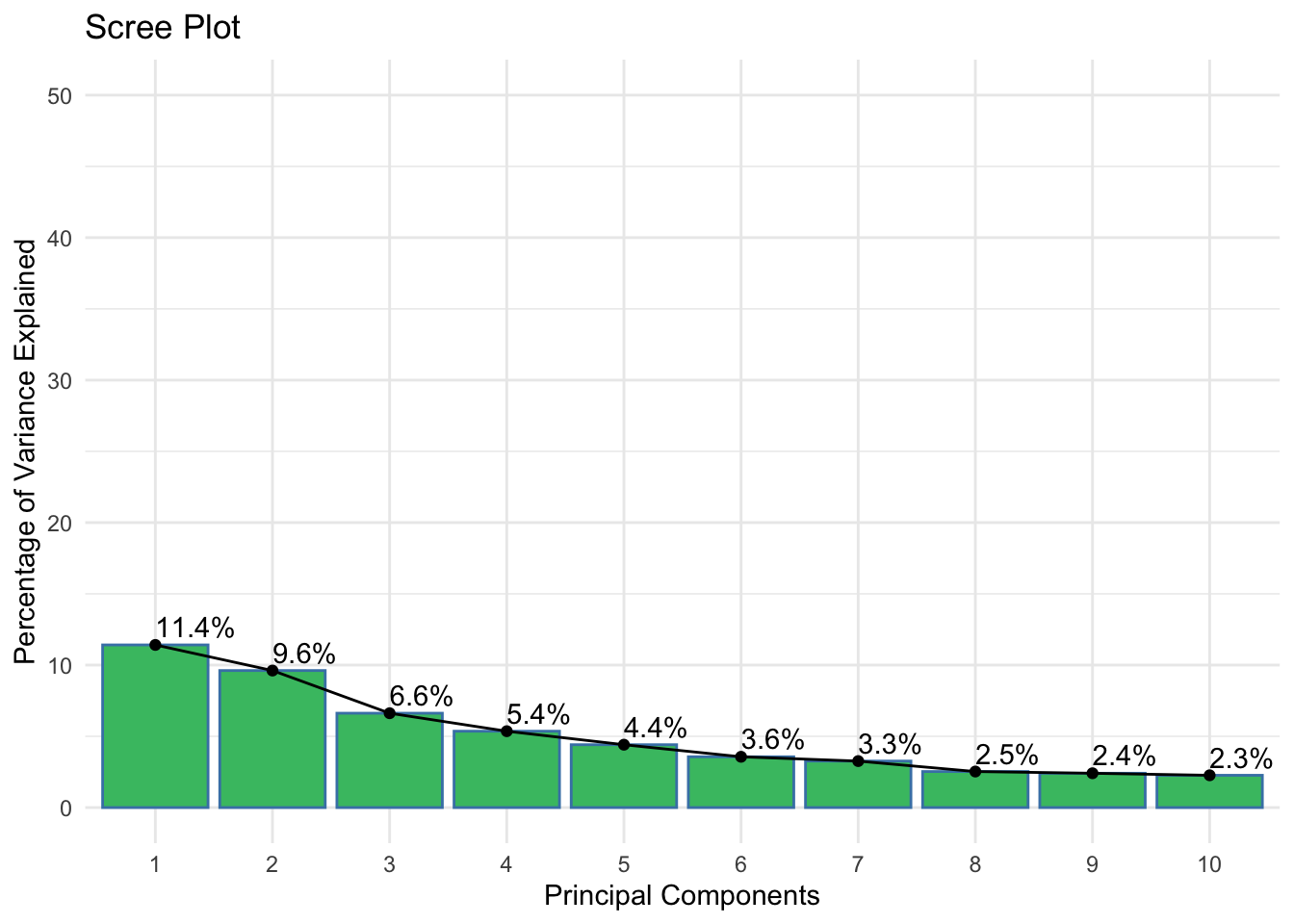
Description: The scree plot shows the percentage of variance explained by each of the principal components.
ggplot(
  data = pca_result %>%
    get_eig() %>%
    rownames_to_column(var = "dimension") %>%
    mutate(q = as.integer(str_remove(dimension, pattern = "Dim.")))
) +
  theme_bw() +
  aes(x = q, y = cumulative.variance.percent) +
  labs(
    title = "Cumulative Variance Explained",
    y = "Percent Variance",
    x = "First q Principal Components"
  ) +
  scale_x_continuous(breaks = seq(0, 100, by = 10)) +
  geom_line() +
  geom_abline(intercept = 80, slope = 0, colour = "darkgreen")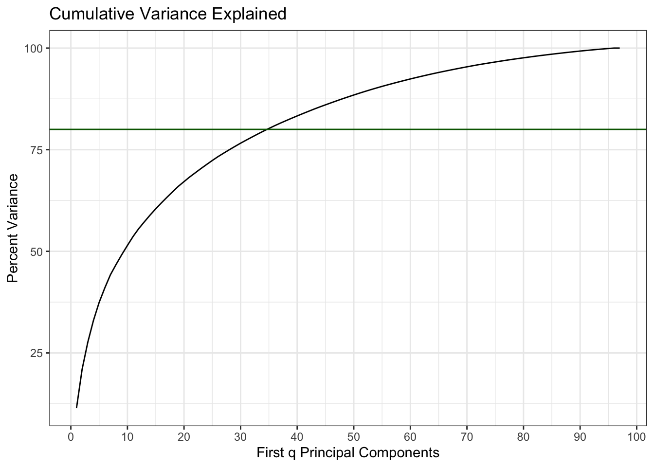
Description: This plot shows that we need the first 35 principal components to explain 80% of the information in the original 550 metabolites.
# Calculate contributions of variables
var_contrib <- get_pca_var(pca_result)$contrib

# Find the top contributing variables
top_contributors <- order(rowSums(var_contrib[, 1:2]), decreasing = TRUE)[1:20]

# PCA Variance Plot focusing on top contributors
fviz_pca_var(
  pca_result,
  # Select top 20 contributing variables
  select.var = list(contrib = 20),
  # Color by contributions to the PCs
  col.var = "contrib",
  # Color gradient
  gradient.cols = viridis(3),
  legend.title = "Contributions",
  # Use repel to avoid text overlap
  repel = TRUE
) +
  labs(title = "PCA Variance Plot (Top 20 Contributors)") +
  theme_minimal() +
  # Adjust text size
theme(text = element_text(size = 12)) 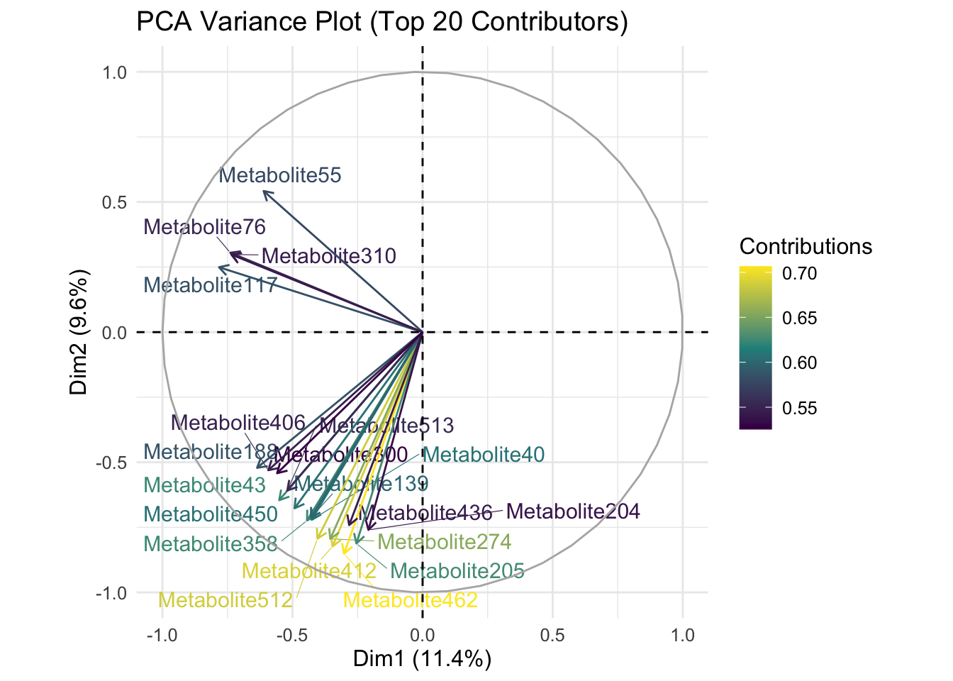
Description: This plot shows the top 20 metabolites contributing to the variance in the first two principal components (Dim1 and Dim2).
38.6 Analyze the Results
38.6.1 Original 550 Metabolites
We first analyze the data without dimension reduction.
# Prepare data for PERMANOVA
# Use the scaled log concentrations and group information; make sure it's a
#   data frame
scaled_data <- as.data.frame(pca_data_wide[, -c(1, 2)])
groups <- pca_data_wide$Group

# Calculate distance matrix
dist_matrix <- dist(scaled_data, method = "euclidean")

# Perform PERMANOVA
permanova_result <- vegan::adonis2(
  dist_matrix ~ groups,
  data = pca_data_wide,
  permutations = 999
)

# Print PERMANOVA results in a table format
permanova_table <-
  permanova_result %>%
  as.data.frame() %>%
  rownames_to_column("Term") %>%
  rename(
    `Sum of Squares` = `SumOfSqs`,
    `R-Squared` = `R2`,
    `F-Value` = `F`,
    `P-Value` = `Pr(>F)`
  )

permanova_table %>%
  kable(format = "html") %>%
  kable_styling(
    bootstrap_options = c("striped", "hover", "condensed", "responsive")
)| Term | Df | Sum of Squares | R-Squared | F-Value | P-Value |
|---|---|---|---|---|---|
| groups | 3 | 913.0529 | 0.1418038 | 5.122275 | 0.001 |
| Residual | 93 | 5525.7948 | 0.8581962 | NA | NA |
| Total | 96 | 6438.8478 | 1.0000000 | NA | NA |
Description: The PERMANOVA results provide statistical evidence of significant differences between the groups consistent with the PCA findings. However, the explained variance by the groups is relatively low.
38.6.2 First 35 Principal Components
Now we use this same method to analyse the differences between groups using only the first 35 principal components of the metabolite data. We use the data after it has been rotated into the new Principal Component vector space (the matrix x returned by the prcomp() function).
# Prepare data for PERMANOVA
reduced_data <- as.data.frame(pca_result$x[, 1:35])

# Calculate distance matrix
dist_matrix_reduced <- dist(reduced_data, method = "euclidean")

# Perform PERMANOVA
permanova_result_pca <- vegan::adonis2(
  dist_matrix_reduced ~ pca_data_wide$Group,
  data = reduced_data,
  permutations = 999
)

# Print PERMANOVA results for PCA in a table format
permanova_table_pca <-
  permanova_result_pca %>%
  as.data.frame() %>%
  rownames_to_column("Term") %>%
  rename(
    `Sum of Squares` = `SumOfSqs`,
    `R-Squared` = `R2`,
    `F-Value` = `F`,
    `P-Value` = `Pr(>F)`
  )

permanova_table_pca %>%
  kable(format = "html") %>%
  kable_styling(
    bootstrap_options = c("striped", "hover", "condensed", "responsive")
)| Term | Df | Sum of Squares | R-Squared | F-Value | P-Value |
|---|---|---|---|---|---|
| pca_data_wide$Group | 3 | 5591.838 | 0.1322579 | 4.7249 | 0.001 |
| Residual | 93 | 36687.972 | 0.8677421 | NA | NA |
| Total | 96 | 42279.811 | 1.0000000 | NA | NA |
Description: The PERMANOVA results provide nearly the same statistical evidence of significant differences between the groups consistent as above.
38.6.3 Post-Hoc Tests
Notice that our two PERMANOVA models had practically the same results. However, post-hoc analysis is tractable for the PCA-based solution: we have to test 35 independent PCs instead of 550 correlated metabolites.
map_dbl(
  .x = reduced_data[, 1:35],
  .f = ~{
    aov(.x ~ pca_data_wide$Group) %>%
      summary() %>%
      # It's a list of length 1 for some stupid reason
      `[[`(1) %>%
      # Get the first row of the p-value column
      `[`(1, "Pr(>F)")
  }
) %>%
  p.adjust(method = "fdr") %>%
  sort()
PC2 PC3 PC4 PC15 PC1 PC10
4.580717e-07 8.427141e-06 3.202219e-03 3.202219e-03 6.129708e-03 2.587854e-02
PC9 PC11 PC6 PC23 PC26 PC13
4.873088e-02 4.873088e-02 1.889783e-01 1.889783e-01 2.520792e-01 3.196502e-01
PC8 PC20 PC25 PC34 PC17 PC5
4.995746e-01 4.995746e-01 4.995746e-01 4.995746e-01 5.138153e-01 5.169234e-01
PC12 PC22 PC16 PC18 PC29 PC7
5.582736e-01 5.582736e-01 5.604406e-01 5.604406e-01 5.604406e-01 6.441355e-01
PC21 PC30 PC19 PC24 PC27 PC28
6.441355e-01 7.876523e-01 9.761812e-01 9.761812e-01 9.761812e-01 9.761812e-01
PC31 PC32 PC33 PC35 PC14
9.761812e-01 9.761812e-01 9.761812e-01 9.761812e-01 9.996913e-01 What is interesting here is that the first principal component isn’t as strongly related to the group as second and third PC. Many times, we are often worried that the first PC (and potentially even the second) are driven by lab effects or batch effects. There is a modification to PCA, called principal variance component analysis which may help here, but that’s beyond the scope of this lesson. At this point though, we’d probably need to re-estimate which metabolites are loading the most onto these top most significant principal components.
38.7 Interpret the Findings
38.7.1 PCA Biplot (Figure 4)
- Interpretation: The separation of different groups in the PCA biplot indicates distinct metabolic profiles among these groups. For example, Group A (circles) and Group C (squares) show some overlap but are generally distinct from Group B (triangles) and Group D (crosses).
- Biological Significance: This suggests that the metabolic pathways or the concentration of metabolites differ among these groups. These differences could be due to varying biological conditions such as health status, environmental factors, or treatment effects.
38.7.2 Scree Plot (Figure 5)
- Interpretation: The first few components explain a substantial amount of variance (e.g., PC1 = 11.4%, PC2 = 9.6%), and the explained variance decreases significantly after the first few components.
- Biological Significance: This indicates that the first few principal components capture the most critical metabolic variations in the data, suggesting that focusing on these components can provide valuable insights into the primary sources of variation in the metabolomic data.
38.7.3 PCA Variance Plot (Figure 6)
- Interpretation: Metabolites like Metabolite55, Metabolite310, and Metabolite76 contribute significantly to the variance in Dim1, while others contribute to Dim2.
- Biological Significance: Identifying these key metabolites can help pinpoint specific biochemical pathways that are most influential in differentiating the sample groups. These metabolites could be biomarkers for certain conditions or targets for therapeutic intervention.
38.8 Conclusion and Discussion
The combination of PCA and PERMANOVA in this study demonstrated the utility of dimensionality reduction techniques in metabolomics. PCA facilitated the visualization and interpretation of complex metabolic data, revealing significant group differences and identifying key metabolites. The PERMANOVA results reinforced these findings by statistically validating the observed group differences.
Overall, dimensionality reduction techniques like PCA are invaluable tools in bioinformatics and systems biology. They enable researchers to distill complex data into actionable insights, paving the way for advances in diagnostics, therapeutics, and personalized medicine. By continuing to leverage these techniques, we can further our understanding of intricate biological systems and improve health outcomes.
38.9 References
- Jia, W., Sun, M., Lian, J., & Hou, S. (2022). Feature dimensionality reduction: a review. Complex & Intelligent Systems, 8(3), 2663-2693.
- Worley, B., & Powers, R. (2013). Multivariate Analysis in Metabolomics. Current Metabolomics, 1(1), 92–107. https://doi.org/10.2174/2213235X11301010092
- Chi, J., Shu, J., Li, M., Mudappathi, R., Jin, Y., Lewis, F., … & Gu, H. (2024). Artificial Intelligence in Metabolomics: A Current Review. TrAC Trends in Analytical Chemistry, 117852.