4 How to Create a Scatterplot
4.1 Introduction to Scatterplots
Scatterplots display the relationship between two variables using dots to represent the values for each numeric variable. This presentation will examine the relationship between GDP per capita and Fertility over time using ggplot with facets.
Hypothesis: A negative relationship exists between GDP per capita and fertility i.e. as GDP per capita increases, fertility decreases.
4.2 Gapminder data description
Data was obtained from the dslabs package and comes from Gapminder a Swedish non-profit organization. The Gapmidner data set has health and income outcomes for 184 countries from 1960 to 2016. Gapminder aims to promote a fact-based worldview by providing accessible and understandable global development data. The dataset covers a wide range of variables, including economic, social, and health-related indicators like GDP, infant mortality, life expectancy, fertility, as well as population, making it a valuable resource for understanding global trends and patterns over time. Countries and territories with missing information were not excluded from the data set as the lack of information can also be looked into and shed light on why data was not collected or provided. To determine whether a country’s health and income outcomes are influenced by population sizes and GDP per capita, the data will be used to create a series of graphs to view different trends.
4.3 Cleaning the data to create a model data frame
A tibble was created from the gapminder dataset, and a new column was created to measure GDP per capita. Overall, using tibbles enhances the readability, usability, and compatibility of your code within the tidyverse ecosystem.
4.4 Components of ggplot2
ggplot2 is a package used to create graphs and visualize data. The main three components of ggplot2 are the data, aesthetics and geom layers.
The data layer - states what data will be used to graph
The aesthetics layer - specifies the variables that are being mapped
The geom layer - specifies the type of graph to be produced

4.5 Code to run interpretable scatterplots and create facets
In order to create a scatter-plot using ggplot, you must specify what data you will be using, state which variables will be mapped and how under aesthetics. What differentiates the scatter-plot from any other type of graph will be specified under the geom layer. For the scatter-plot, geom_point will be used.
In this example, we will analyze the relationship between fertility rates and gdp per capita for each country in 2011.
fig_bubble_2011 <-
  ggplot(data = filter(gapminder_df, year == 2011)) +
  aes(x = gdp_per_capita, y = fertility) +
  geom_point()

fig_bubble_2011 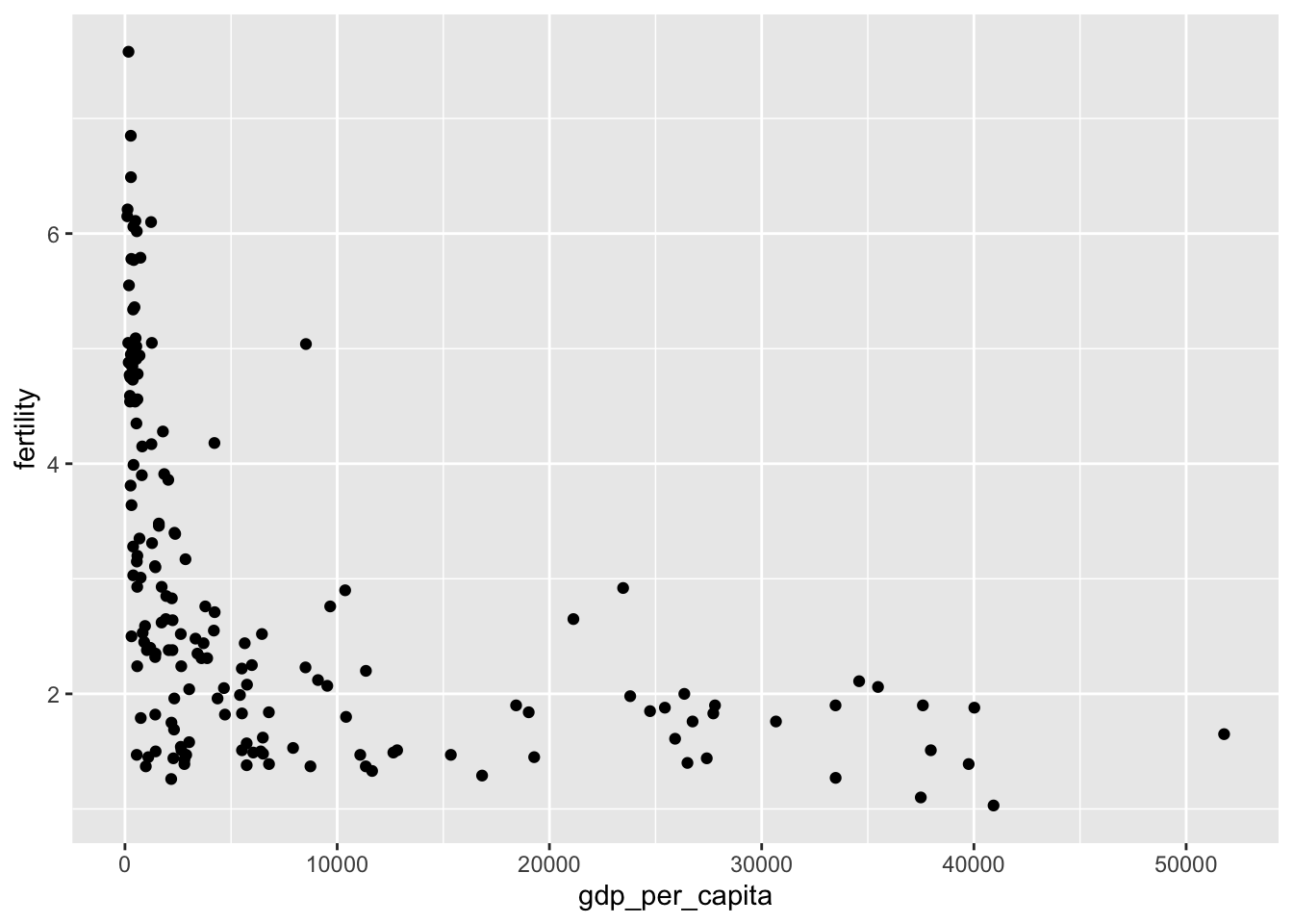
In the example above, we have mapped out fertility as our y-axis and gdp per capita as our x-axis. However, at it’s very basic level, there is not enough information provided to accurately analyze the relationship between the two. For this reason, we can add additional layers that will provide more information to properly analyze the scatter-plot.
fig_bubble_pretty_2011 <-
  ggplot(data = filter(gapminder_df, year == 2011)) +
  aes(
    x = gdp_per_capita,
    y = fertility,
    # will change the size of the point based on population size
    size = population,
    # will assign colors based on the continent the country is in
    color = continent
  ) +
  # gives a range as to how big or small the points of population should be
  scale_size(range = c(1, 20)) +
  # removes N/A from the legend and titles it Continent
  scale_colour_discrete(na.translate = F, name = "Continent") +
  # removes population size from the legend
  guides(size = "none") +
  scale_x_continuous(
    name = "GDP per Capita",
    trans = "log10",
    # transforms numbers from scientific notation to regular number
    labels = scales::comma
  ) +
  labs(
    title = "Fertility rate descreases as GDP per capita increases in 2011",
    y = "Fertility rates",
    caption = "Source: Gapminder"
  ) +
  # the ylim was set based on the fertility, lowest was near 1 & highest was above 7
  ylim(1.2, 8.0) +
  # alpha increases transparency of the points to ensure they can all be seen
  geom_point(alpha = 0.5)

fig_bubble_pretty_2011
Figure 4.2 builds on the previous scatterplot of Fertility Rates (y axis) against GDP per capita (x axis) for 2011. The bubble size depicts respective country populations, and continents are coded by colors according to the key. This figure displays a negative relationship between GDP per capita and Fertility Rates. It supports the Hypothesis which states that as GDP per capita increases, Fertility Rates decreases. This trend can be confirmed for all continents, however, the degree to which fertility rates drop between continents varies. Most European country appear below a fertility rate of 2 babies per woman. The Americas appear to follow closely behind (under 4), followed by Oceania and Asia. A significant number of African countries still maintained higher fertility rates with lower GDP per capita for 2011.
This is an example of wanting to create four separate graphs to see the relationship between fertility rates and GDP per capita based on the years 1960, 1975, 1990 and 2005. In this example we omitted the facet argument.
fig_bubble_multiple <-
  ggplot(data = filter(gapminder_df, year %in% c(1960, 1975, 1990, 2005))) +
  aes(
    x = gdp_per_capita,
    y = fertility,
    size = population,
    color = continent
  ) +
  scale_x_continuous(
    name = "GDP per Capita",
    trans = "log10",
    labels = scales::comma
  ) +
  scale_size(range = c(0, 20)) +
  guides(size = "none") +
  scale_colour_discrete(na.translate = FALSE, name = "Continent") +
  labs(
    title = "Fertility continues to decrease as GDP per capita increases",
    caption = "Source: Gapminder",
    y = "Fertility rates"
  ) +
  geom_point(alpha = 0.3)

fig_bubble_multiple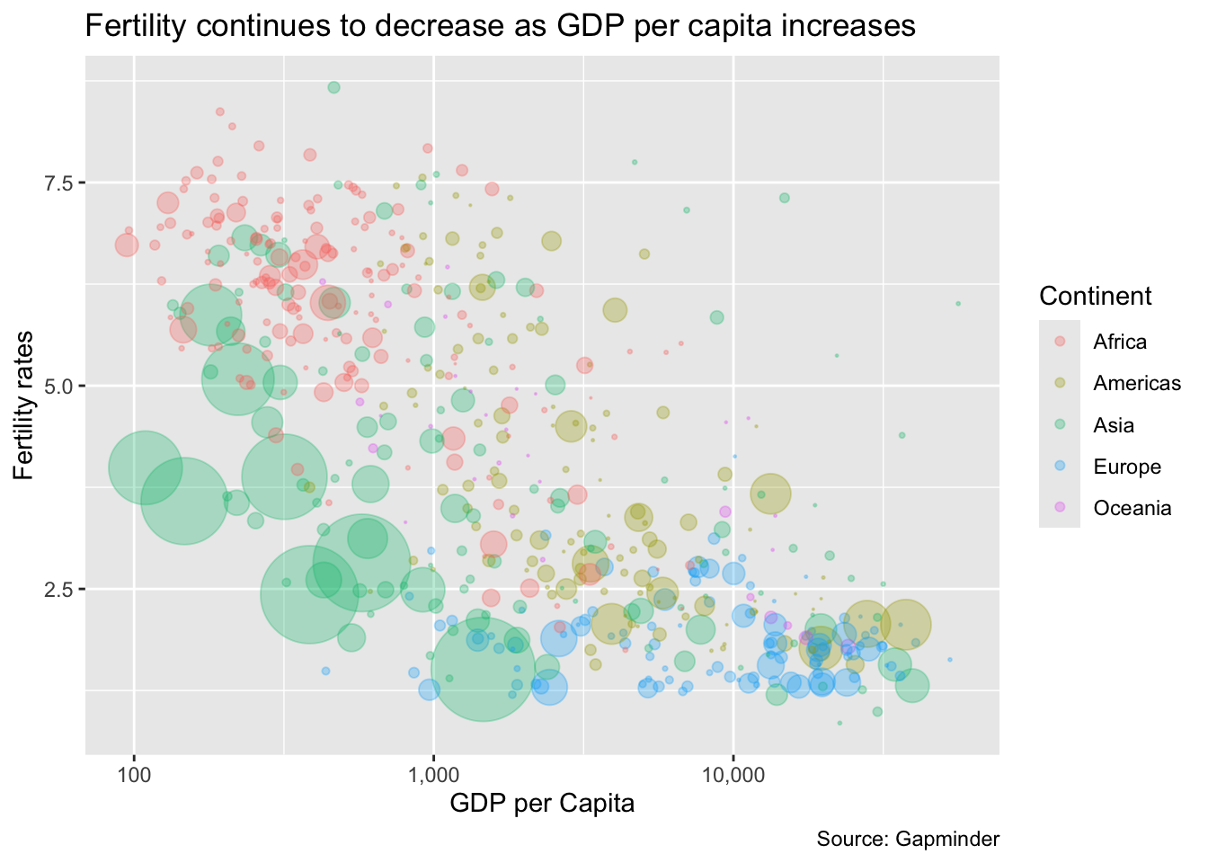
Without having used the facet argument, all points of all four years have been included into one graph. This graph does not provide us with the information we were looking for.
fig_bubble_multiple_facet <-
  ggplot(data = filter(gapminder_df, year %in% c(1960, 1975, 1990, 2005))) +
  aes(
    x = gdp_per_capita,
    y = fertility,
    size = population,
    color = continent
  ) +
  scale_x_continuous(
    name = "GDP per Capita",
    trans = "log10",
    labels = scales::comma
  ) +
  scale_size(range = c(0, 20)) +
  guides(size = "none") +
  scale_colour_discrete(na.translate = FALSE , name = "Continent") +
  labs(
    title = "Fertility continues to decrease as GDP per capita increases",
    caption = "Source: Gapminder",
    y = "Fertility rates"
  ) +
  geom_point(alpha = 0.3) +
  # specifiying we want the graphs split based on year
  facet_wrap(~ year)

fig_bubble_multiple_facet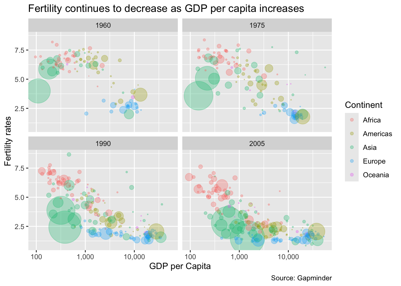
facet
Now that we’ve specified the facet argument, we now have four separate graphs that can be properly analysed. In Figure 4.4 we see an increasingly negative relationship between the two variables over time. This observation is congruent with the hypothesis that as GDP per capita increases, fertility decreases.
This global trend can be attributed to the increasing proportion of women in the workforce in the mid to late 20th century. As a result of World War II (1939-1945), women took on roles outside the home to compensate for men at war. Despite increased GDP per capita, this may have contributed to reduced fertility (babies per woman) over time. In 1960, a clear disparity among continents is seen. Most European countries’ fertility rates fell below 5, while their GDP per capita increased. Most African countries maintained high fertility rates above 5, but little change is seen in GDP per capita. The Asian continent shows the most variation among countries during that year. Some smaller Asian countries continued to maintain high fertility rates as GDP per capita increased in 1960. However, others displayed a drastic decrease in fertility rates by 1960. The Americas followed a steady decline over the years. By 2005, an overall negative relationship can be seen with most countries’ fertility rates below 5 babies per woman.
fig_bubble_row_2011 <-
  ggplot(data = filter(gapminder_df, year == 2011)) +
  aes(
    x = gdp_per_capita,
    y = fertility
  ) +
  geom_point(alpha = 0.5) +
  facet_wrap(~ continent, nrow = 1)

fig_bubble_row_2011 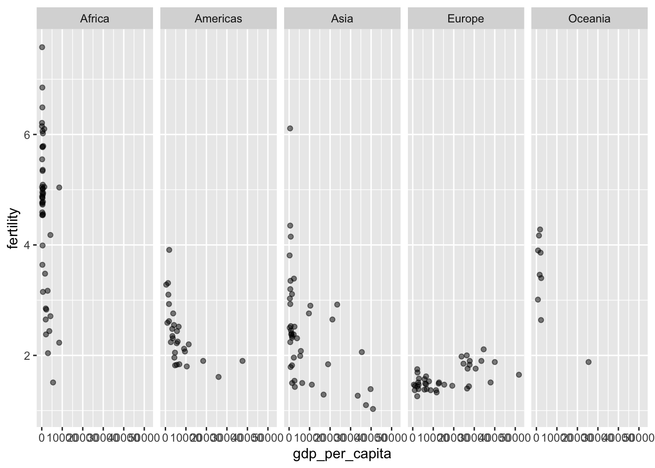
In the graph above, we see an example of separating the single graph into graphs based on continent. It has also been specified to have all graphs appear in one single row through the nrow argument. Very importantly however, this graph is unclear and cannot be used to compare the relationship between fertility and gdp per capita.
fig_bubble_facet_2011 <-
  ggplot(data = filter(gapminder_df, year == 2011)) +
  aes(
    x = gdp_per_capita,
    y = fertility
  ) +
  scale_x_continuous(
    name = "GDP per Capita",
    trans = "log10",
    labels = scales::comma
  )  +
  geom_point(alpha = 0.5) +
  facet_wrap(~ continent)

fig_bubble_facet_2011 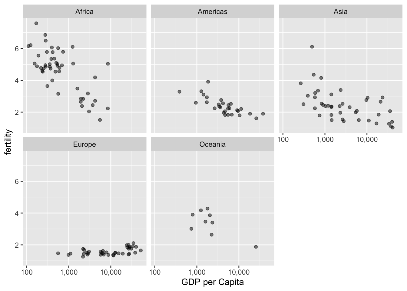
nrow
In the next example above, we removed the nrow argument and the system automatically separated the graphs into three columns with two rows. Additionally, we changed the x-axis to a log scale to better interpret gdp per capita. There is a way to determine a relationship between fertility and gdp per capita by continent.
4.6 Public Health Interpretation
A global negative trend is depicted between GDP per capita and fertility over time. Such changes were due to wars as well as social, cultural and economic changes that incentivize smaller families especially in Asian countries. Most European, American and Asian countries depicted significant decreases in fertility rates over time as GDP per capita increased. On the other hand, African countries remain in the top rank for fertility over the years. These differences are depicted in the population pyramid changes of developed vs developing countries. Public health policies can be tailored to incentivizing increased fertility in developed countries to ensure generation continuity, and effective family planning strategies in developing countries.
4.7 Conclusion
In this lesson, the basic functions of ggplot2 package were shown, which can create a scatterplot. There are three layers to the code to make a plot in R: data, aesthetic, and geometric. Within the aesthetic layer, functions can be added such as size and color to analyze more variables. Additionally, facets can split up graphs over a categorical variable, adding another potential variable to analyze in the plot.