# install.packages("gmodels", dependencies = TRUE)
# install.packages("car", dependencies = TRUE)
# install.packages("DescTools", dependencies = TRUE)
# install.packages("ggplot2", dependencies = TRUE)
# install.packages("qqplotr", dependencies = TRUE)
# install.packages("gtsummary", dependencies = TRUE)18 Mann-Whitney-U Test Example
18.1 Introduction
-
Mann Whitney U test, also known as the Wilcoxon Rank-Sum test, is a nonparametric statistical test of the null hypothesis, which is commonly used to compare the means or medians of two independent groups with the assumption that the at least one group is not normally distributed and when the sample size is small.
- The Welch U test should be used when signs of skewness and variance of heterogeneity.
-
It is useful for numerical/continuous variables.
- For example, if researchers want to compare the age or height of two different groups (as continuous variables) in a study with non-normally distributed data.
When conducting this test, aside from reporting the p-value, the spread and the shape of the data should be described.
Overall goal: Identify whether the distribution of two groups significantly differs.
18.1.0.1 Assumptions
Samples are independent: Each dependent variable must be related to only one independent variable.
The response variable is ordinal or continuous.
At least one variable is not normally distributed.
18.1.1 Hypotheses
Null Hypothesis (H0): Distribution1 = Distribution2
- Mean/Median Ranks of two levels are equal.
Alternate Hypothesis (H1): Distribution1 ≠ Distribution2
- Mean/Median Ranks of two levels are significantly different.
18.1.1.1 Mathematical Equation
\(U_1 = n_1n_2 + \frac{n_1 \cdot (n_1 + 1)}{2} - R_1\)
\(U_2 = n_1n_2 + \frac{n_2 \cdot (n_2 + 1)}{2} - R_2\)
Where:
- \(U_1\) and \(U_2\) represent the test statistics for two groups (Male & Female).
- \(R_1\) and \(R_2\) represent the sum of the ranks of the observations for two groups.
- \(n_1\) and \(n_2\) are the sample sizes for two groups.
18.2 Performing Mann-Whitney U Test in R
18.2.1 Data Source
In this example, we will perform the Mann-Whitney U Test using wave 8 (2012-2013) data of a longitudinal epidemiological study titled Hispanic Established Populations For the Epidemiological Study of Elderly (HEPESE).
The HEPESE provides data on risk factors for mortality and morbidity in Mexican Americans in order to contrast how these factors operate differently in non-Hispanic White Americans, African Americans, and other major ethnic groups. The data is publicly available and can be obtained from the University of Michigan website. For the purposes of this report/chapter, the example in the analysis uses synthetic data. Using this data, we want to explore whether there are significant gender differences in age when Type 2 diabetes mellitus (T2DM) is diagnosed. Type 2 diabetes is a chronic disease condition that has affected 37 million people living in the United States. Type 2 diabetes is the eighth leading cause of death and disability in US. Type 2 diabetes generally occurs among adults aged 45 or older, but may also occur amongst young adults and children. Diabetes and its complications are often preventable by following lifestyle guidelines and taking medication in a timely manner. 1 in 5 of US people don’t know they have diabetes.
Research has shown that men are more likely to develop type 2 diabetes, while women are more likely to experience complications from type 2 diabetes, including heart and kidney disease.
In this report, we want to test whether there are significant differences in age at which diabetes is diagnosed among males and females.
Dependent Response Variable: ageAtDx = Age_Diagnosed = Age at which diabetes is diagnosed.
Independent Variable: isMale = Gender
Research Question: Does the age at which diabetes is diagnosed significantly differ among men and women?
Null Hypothesis (H0): Mean rank of age at which diabetes is diagnosed is equal among men and women.
Alternate Hypothesis (H1): Mean rank of age at which diabetes is diagnosed is not equal among men and women.
18.2.2 Packages
gmodels: Helps to compute and display confidence intervals (CI) for model estimates.
DescTools: Provides tools for basic statistics e.g. to compute Median CI for an efficient data description.
ggplot2: Helps to create boxplots.
qqplotr: Helps to create QQ plot.
dplyr: Used to manipulate data and provide summary statistics.
haven: Helps to import SPSS data into r.
Dependencies = TRUE : Indicates that while installing packages, it must also install all dependencies of the specified package.
Loading Library
suppressPackageStartupMessages(library(haven))
suppressPackageStartupMessages(library(ggpubr))
suppressPackageStartupMessages(library(gmodels))
suppressPackageStartupMessages(library(DescTools))
suppressPackageStartupMessages(library(ggplot2))
suppressPackageStartupMessages(library(qqplotr))
suppressPackageStartupMessages(library(gtsummary))
suppressPackageStartupMessages(library(tidyverse))
Data Importing
HEPESE <- read_csv("../data/03_HEPESE_synthetic_20240510.csv")Rows: 744 Columns: 2
── Column specification ────────────────────────────────────────────────────────
Delimiter: ","
dbl (1): ageAtDx
lgl (1): isMale
ℹ Use `spec()` to retrieve the full column specification for this data.
ℹ Specify the column types or set `show_col_types = FALSE` to quiet this message.18.2.3 Data Exploration
# str(HEPESE)
str(HEPESE$isMale)
logi [1:744] FALSE FALSE FALSE TRUE FALSE TRUE ...str(HEPESE$ageAtDx) num [1:744] 87 70 68 60 55 33 38 65 50 68 ...After inspecting the data, we found that values of our dependent and independent variable values are in character format. We want them to be numerical and categorical, respectively. First, we will convert the dependent variable into numerical form, and our independent variable into categorical. Then, we will recode the factors as male and female. For simplicity’s sake, we will also rename our dependent and independent variable.
# convert to number and factor
HEPESE$ageAtDx <- as.numeric(HEPESE$ageAtDx)
class(HEPESE$ageAtDx)
[1] "numeric"[1] "factor"The next step is to calculate some of the descriptive data to give us a better idea of the data that we are dealing with. This can be done using the summarise function.
Descriptive Data
Des <-
 HEPESE %>%
 select(isMale, ageAtDx) %>%
 group_by(isMale) %>%
 summarise(
   n = n(),
   mean = mean(ageAtDx, na.rm = TRUE),
   sd = sd(ageAtDx, na.rm = TRUE),
   stderr = sd/sqrt(n),
   LCL = mean - qt(1 - (0.05 / 2), n - 1) * stderr,
   UCL = mean + qt(1 - (0.05 / 2), n - 1) * stderr,
   median = median(ageAtDx, na.rm = TRUE),
   min = min(ageAtDx, na.rm = TRUE),
   max = max(ageAtDx, na.rm = TRUE),
   IQR = IQR(ageAtDx, na.rm = TRUE),
   LCLmed = MedianCI(ageAtDx, na.rm = TRUE)[2],
   UCLmed = MedianCI(ageAtDx, na.rm = TRUE)[3]
 )

Des
# A tibble: 2 × 13
isMale n mean sd stderr LCL UCL median min max IQR LCLmed
<fct> <int> <dbl> <dbl> <dbl> <dbl> <dbl> <dbl> <dbl> <dbl> <dbl> <dbl>
1 FALSE 455 67.6 14.1 0.661 66.3 68.9 70 18 93 19 68
2 TRUE 289 67.1 15.1 0.886 65.3 68.8 70 20 94 18 68
# ℹ 1 more variable: UCLmed <dbl>n: The number of observations for each gender.
mean: The mean age when diabetes is diagnosed for each gender.
sd: The standard deviation of each gender.
stderr: The standard error of each gender level. That is the standard deviation / sqrt (n).
LCL, UCL: The upper and lower confidence intervals of the mean. This values indicates the range at which we can be 95% certain that the true mean falls between the lower and upper values specified for each gender group assuming a normal distribution.
median: The median value for each gender.
min, max: The minimum and maximum value for each gender.
IQR: The interquartile range of each gender. That is the 75th percentile – 25th percentile.
LCLmed, UCLmed: The 95% confidence interval for the median.
Checking Assumptions and Visualizing the Data
The next step is to visualize the data. This can be done using different functions under the ggplot package.
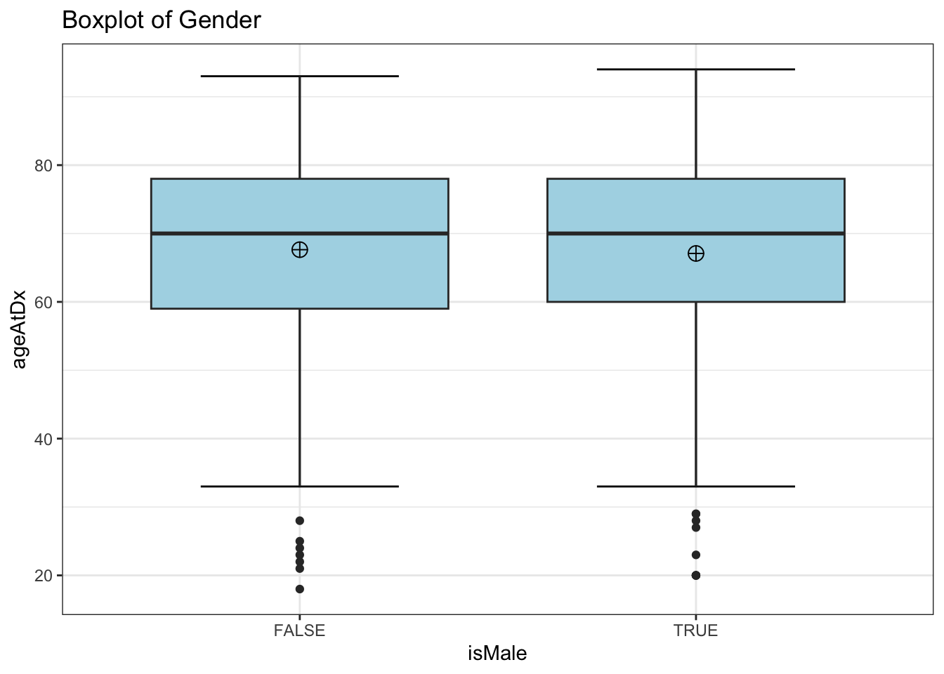
1) Box plot
ggplot(
 HEPESE,
 aes(
   x = isMale,
   y = ageAtDx,
   fill = isMale
 )
) +
 stat_boxplot(
   geom = "errorbar",
   width = 0.5
 ) +
 geom_boxplot(
   fill = "light blue"
 ) +
 stat_summary(
   fun = mean,
   geom = "point",
   shape = 10,
   size = 3.5,
   color = "black"
 ) +
 ggtitle(
   "Boxplot of Gender"
 ) +
 theme_bw() +
 theme(
   legend.position = "none"
 )
2) QQ plot
library(conflicted)
conflict_prefer("stat_qq_line", "qqplotr", quiet = TRUE)


# Perform QQ plots by group
QQ_Plot <-
ggplot(
 data = HEPESE,
 aes(
   sample = ageAtDx,
   color = isMale,
   fill = isMale
 )
) +
 stat_qq_band(
   alpha = 0.5,
   conf = 0.95,
   qtype = 1,
   bandType = "boot"
 ) +
 stat_qq_line(
   identity = TRUE
 ) +
 stat_qq_point(
   col = "black"
 ) +
 facet_wrap(
   ~ isMale, scales = "free"
 ) +
 labs(
   x = "Theoretical Quantiles",
   y = "Sample Quantiles"
 ) + theme_bw()

QQ_Plot
stat_qq_line: Draws a reference line based on the data quantiles.
-
Stat_qq_band: Draws confidence bands based on three methods; “pointwise”/“boot”,“Ks” and “ts”.
"pointwise"constructs simultaneous confidence bands based on the normal distribution;"boot"creates pointwise confidence bands based on a parametric boostrap;"ks"constructs simultaneous confidence bands based on an inversion of the Kolmogorov-Smirnov test;"ts"constructs tail-sensitive confidence bands
-
Stat_qq_Point: Is a modified version of ggplot: : stat_qq with some parameters adjustments and a new option to detrend the points.
3) Histogram
A histogram is the most commonly used graph to show frequency distributions.
ggplot(HEPESE) +
  aes(x = ageAtDx, fill = isMale) +
  geom_histogram() +
facet_wrap(~ isMale) 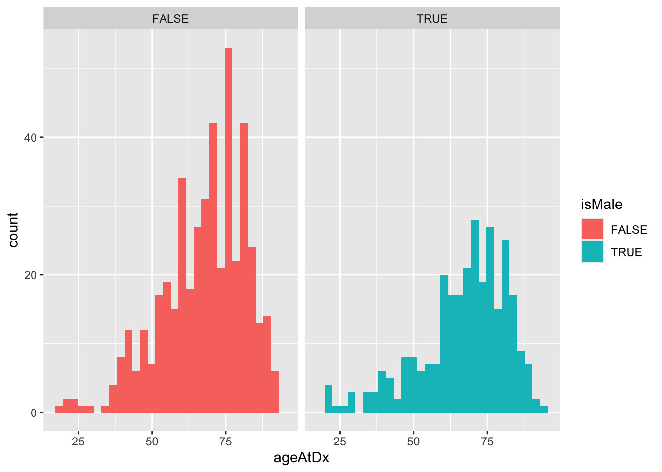
**3b) Density curve in Histogram**A density curve gives us a good idea of the “shape” of a distribution, including whether or not a distribution has one or more “peaks” of frequently occurring values and whether or not the distribution is skewed to the left or the right.
ggplot(HEPESE) +
  aes(
    x = ageAtDx,
    fill = isMale
  ) +
  labs(
    x = "Age When diabetes is diagnosed",
    y = "Density",
    fill = "Gender",
    title = "A Density Plot of Age when diabetes is diagnosed",
    caption = "Data Source: HEPESE Wave 8 (ICPSR 36578)"
  ) +
  geom_density() +
  facet_wrap(~isMale)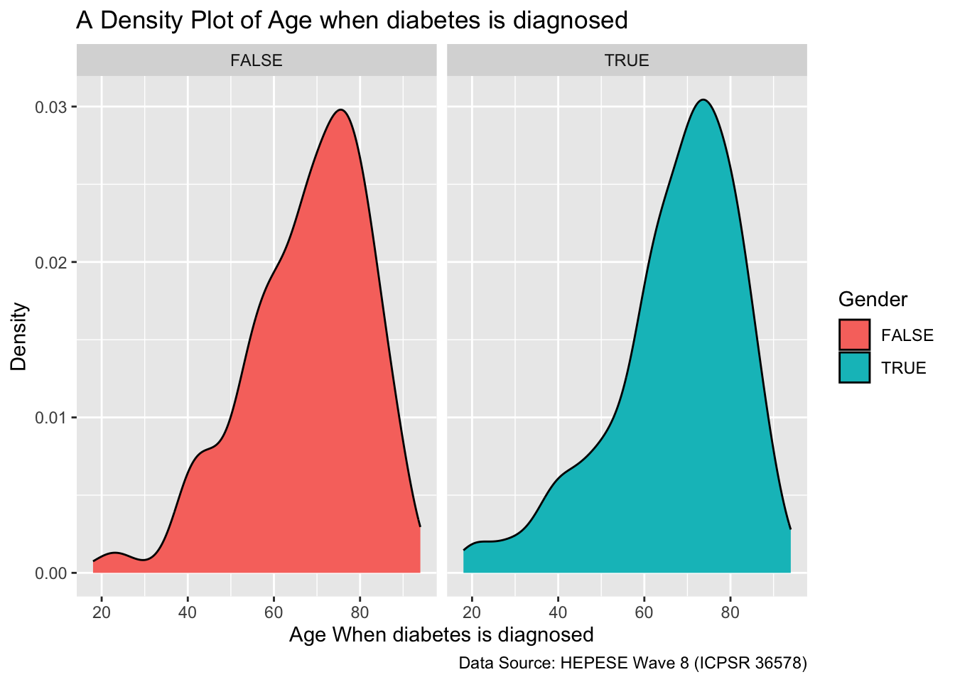
This density curve shows that our data does not have a bell shaped distribution and it is slightly skewed towards the left.
4) Statistical test for normality
HEPESE %>%
  group_by(isMale) %>%
  summarise(
    `W Stat` = shapiro.test(ageAtDx)$statistic,
    p.value = shapiro.test(ageAtDx)$p.value
  )
# A tibble: 2 × 3
isMale `W Stat` p.value
<fct> <dbl> <dbl>
1 FALSE 0.959 6.50e-10
2 TRUE 0.937 9.99e-10Interpretation
From the above table, we see that the value of the Shapiro-Wilk Test is 0.0006 and 0.000002, which are both less than 0.05. Therefore we have enough evidence to reject the null hypothesis and confirm that the data significantly deviates from a normal distribution.
18.2.4 Mann Whitney U Test
result <- wilcox.test(
  ageAtDx ~ isMale,
  data = HEPESE,
  na.rm = TRUE,
  exact = FALSE,
  conf.int = TRUE
)

tibble(
  Test_Statistic = result$statistic,
  P_Value = result$p.value,
  Method = result$method
)
# A tibble: 1 × 3
Test_Statistic P_Value Method
<dbl> <dbl> <chr>
1 66178 0.880 Wilcoxon rank sum test with continuity correction18.3 Results
While the analysis above is for synthetic data, we see that the mean age at which diabetes is diagnosed is not significantly different in males (69 years old) and females (66 years old). Of note, the Mann-Whitney U-Test applied in the real data (not shown in this report) showed that this difference is not statistically significant at 0.05 level of significance because the statistical p value (p=.155) is greater than the critical value (p=0.05). For the real data, the test statistic is W = 5040.
18.4 Conclusion
From the above result, we can conclude that gender does not play a significant role in the age at which one is diagnosed with diabetes. Diabetes is the 8th leading cause of death and disability in the US, and 1 in 5 US adults are currently unaware of their diabetes condition. This urges the need for increased policy efforts towards timely diabetes testing and diagnosing. Although previous research has suggested that there are gender based differences in diabetes related severity of inquiries, our findings suggest that this difference is not due to age, and may be due to other gender based differences, such as willingness to seek medical care, underlying health issues, etc. There may not necessarily be a need for gender-based approaches to interventions aimed at increasing diabetes surveillance, and efforts should focus on targeting the population as a whole.